
If you are deploying Peplink multi wan devices with captive portals then take a look at this new design for an external Splash Page.
Free Wi-Fi on Public Transport
I have been working on a large number of Wi-Fi deployments for public transport recently (mainly using HD2‘s and BR1‘s) to provide free public Wi-Fi hotspots. In these deployments the end customer is often a big Brand who are offering free Wi-Fi to enable them to put an advert in front of the passengers using a splash page before they then get internet access.
Captive Portals are Easy with Peplink
Using a captive portal on Peplink devices is dead easy, you simply navigate to the Captive Portal settings page in the webui on the device and turn it on for the LAN segment (wired or wireless) you want it to be active for – so no issues there. However since the customer wanted their own custom designed page to be shown first before the authentication process, the in built Splash Page on the device wasn’t going to cut it, we needed to host both the splash page and the user authentication externally.
External Splash Page
There is a really useful knowledgebase article that details how to do this and how the authentication process works when using an external splash page, it also has a link to an example external splash page written in php to get you started.
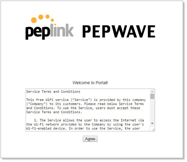
To keep things quick and easy (always my favoured approach), we deployed a custom branded splash page which was purely for the customer branding that then linked to this sample code from the knowledgebase article which subsequently performed the authentication and allowed the clients access to the internet. Job done.
Room for Improvement

Well almost. Although the sample code works just fine, it looks a little dated, and perhaps more importantly its not responsive so is awkward to use on devices with smaller screen sizes (you can see the agree button looks tiny on the Android smartphone screenshot).
To be fair, the sample code from the KB article is just that – an example of how to code the page, and since the design is about 5 years old its certainly not intended to represent the best practise for mobile web design with today’s smart devices as targets.
So, once the initial deployment was complete, I decided to roll up my sleeves and take a look at redoing the design to better suit these kinds of deployments.
A Quick Wireframe
I started with a quick wireframe as you can see below, taking into consideration that the client device could be both a larger device (a tablet or even a laptop) as well as a smartphone sized device, and that these could be in either a portrait or landscape format.
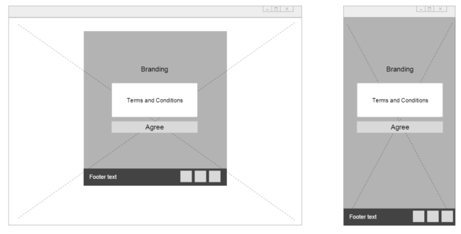
I wanted to incorporate the following design features:
- Full background image (for branding) that resizes dynamically to the viewport size
- centralised content area for the terms and conditions, login fields (if needed) and notifcation.
- a footer section for sub branding (often in these types of deployments there is a primary brand and then a technology company that is enabling them). Sub branding allows everyone to have a piece of the screen real-estate if they choose to do so.
Next all I needed to do was to work out the most efficient way to make this responsive and compatible with as broad a number of devices as possible.
Front End Frameworks Rock
A quick Google search returned a number of front end frameworks that would likely assist me, and I settled on Foundation from Zurb. I have been looking for an excuse to have a play with it for ages.
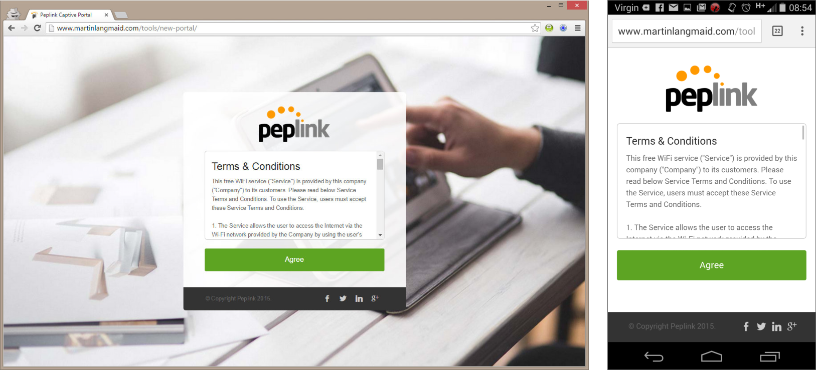
The Final Design
Here is the resultant design shown on chrome and on an android device.
I’ll put the link to the source for this below but before I do I’d like to make you aware of the following:
- This should be considered as a beta release. I have not fully tested this yet – its not currently in production anywhere, so if you do use it test the hell out of it before you go live.
- The message notifications aren’t very clever and could do with more display logic. At the moment all messages are shown in a blue information bar within the main content section above the branding section. The messages could do with being colour coded and having some help text associated with them to explain what the next steps are.

So without further ado, here is the link to this design – I hope you find it useful.